Throwing the clichés overboard to create a modern female brand for The Maiden Factor
We believe brands play an important role in positively shaping ideas about gender. This is best demonstrated by legendary campaigns like Sport England’s ‘This Girl Can’, which have been praised for combatting stereotypes and kicking off a cultural shift in how women are represented in the media.
It’s pretty damn brilliant to see this shift in posters and TV ads, but why isn’t this fearless show of feminism translating into design? Take Dove for example. Its campaign for Real Beauty has been leading the way in redefining perceptions of female beauty for over a decade, yet it still packages its products in a way that’s overwhelmingly pure, white and delicate. It just doesn’t add up.
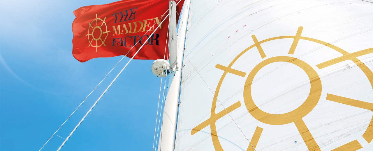
As the women’s rights movement goes global and mainstream, it’s instrumental that brands start translating their progressive ideas into credible designs that challenge our assumptions about women (or men for that matter). So, when non-for-profit organisation, The Maiden Factor asked us to craft them a brand to match their mission of empowering girls through education, we couldn’t wait to dive straight in. Taking its name from Maiden – the first boat to be sailed around the world by an all-female crew – The Maiden Factor had fearlessness in its DNA. And with its iconic boat set to return home after 27 years, all it needed was a logo to carry its bold vision of female empowerment into the future.
The first point of navigation was to avoid the clichés of female branding. It was crucial the visual language we used empowered rather than pigeonholed women. This meant ditching the prissy pinks and submerging ourselves in the nautical heritage of the charity to create something truly inspiring. Seizing on the symbol of the boat’s helm, we developed a distinct visual metaphor that reflects how the organisation is (literally) steering the way towards female empowerment. We then subtly fused this with the universal symbol for gender, which we repeated around the wheel to pay tribute to the nature of women coming together.
Another crucial aspect of this brief involved developing a design to empower women without alienating men. Modern feminism has long shaken its associations with ‘men-hating’ and for The Maiden Factor, it was just as important to get men on board with their worthy cause as women. Sadly, gender-neutral design is often taken to mean drab or non-descript. This is something we set out to counter with a vibrant colour palette of gold, red and black – as majestic and distinctive as it is inclusive.
Having locked down the fundamentals of The Maiden Factor’s brand, we then brought world-renowned craftsmen, Chris Mitchell and Chris Weir on board to help refine the design. Whilst Mitchell lent a hand crafting the marque, Weir got to work reimagining the typeface originally used on the livery of the Maiden boat to create a bespoke typestyle that’s neither hard-edged nor ornamental.
The result? A bold, progressive and sophisticated brandmark totally prepared to weather the test of time.
- New Solar Panels at HERE 15/4 >
- Cheers and Laughter: HERE Office Centre Wraps Up Another Epic Christmas Bash for Tenants! 20/12 >
- HERE Office Centre Celebrates Local Spirit in Successful Christmas Market 18/12 >
This conclusive run down of what to do in #Bristol from @VisitBristol has taken inspiration from the biggest and be…
https://t.co/MjLCCfxU3G